Safe Area & Layout
Geometry Synchronization
Emuluxe handles the complex geometry of modern edge-to-edge displays by accurately simulating the physical bounds of the device hardware, including rounded corners, hardware notches, and dynamic islands. Emuluxe’s Safe Area & Layout Engine provides pixel-perfect simulation of these physical obstructions, allowing you to build layouts that look professional on any hardware.
Understanding Safe Areas
Safe areas are the portions of the screen where your content is guaranteed to be visible and interactive, without being obscured by the OS (Home Indicators) or Hardware (Notches).
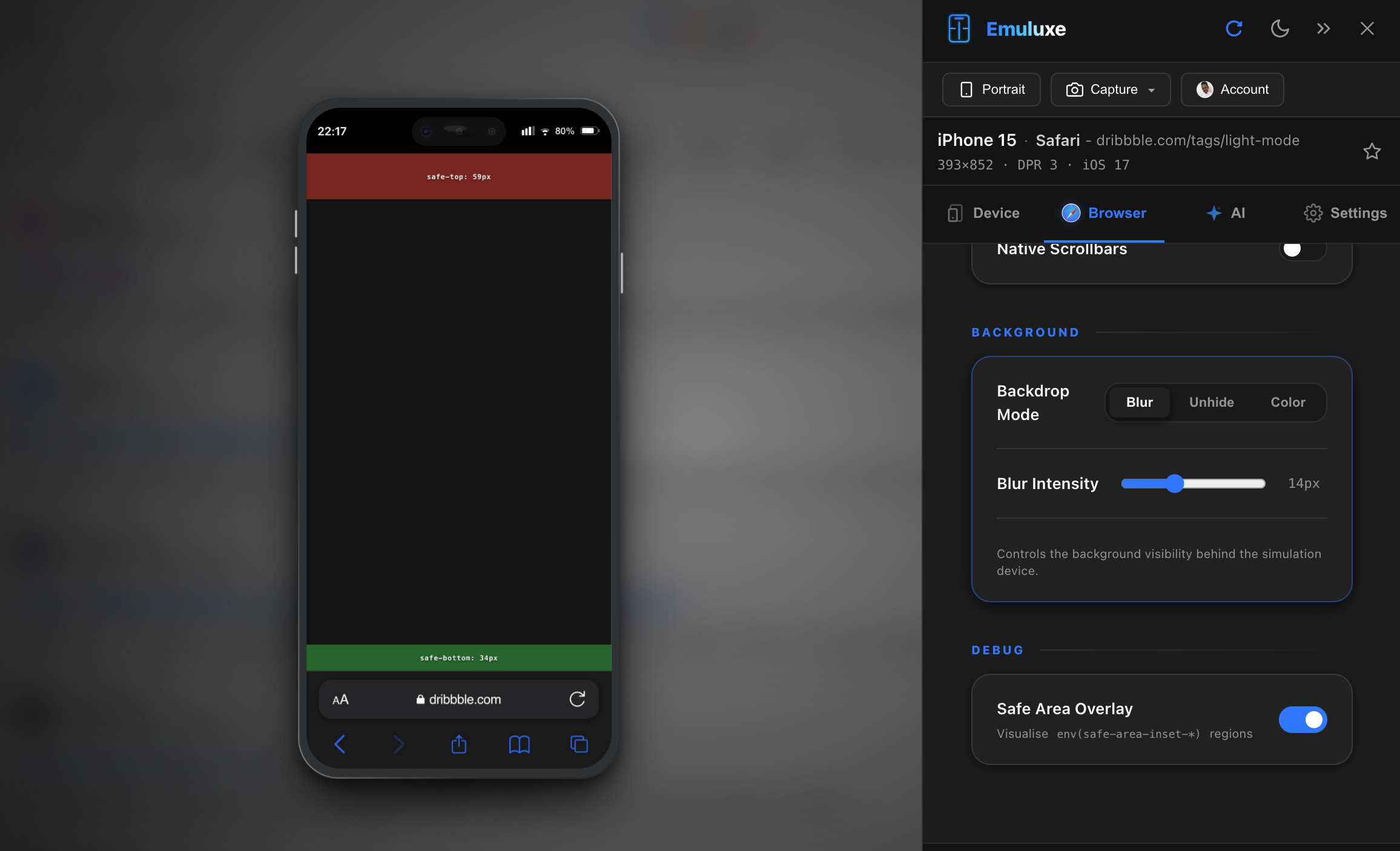
1. CSS Environment Variables
Emuluxe correctly injects and updates the standard CSS environment variables for every Foundry device:
env(safe-area-inset-top): Corresponds to the height of the notch or status bar.env(safe-area-inset-bottom): Corresponds to the software home indicator bar on home-buttonless devices.env(safe-area-inset-left/right): Active during Landscape Orientation, as hardware notches move to the side.
2. Viewport-Fit=Cover
We simulate the behavior of the viewport-fit=cover meta tag. When enabled, your site’s background extends to the device's edges, while Emuluxe manages the safe-area padding to keep critical text and UI elements protected.
Geometry Simulation across the Foundry
| Hardware Feature | Foundry Behavior |
|---|---|
| Notches & Islets | High-precision SVG cutouts that obscure underlying content in real-time. |
| Rounded Corners | CSS-isolated clip-path masks applied to the viewport root to match physical corner radius. |
| Dynamic Islands | Interactive overlays for the iPhone 14/15/16 Pro series that dynamically change size based on OS state. |
| Edge Bezels | Visual indicators for "Dead Zones" where touch sensitivity might be reduced. |
Why testing Safe Areas matters
Most traditional DevTools ignore safe areas entirely. In the Foundry, you can audit:
- Navigation Obstruction: Ensuring your "Fixed" bottom navigation bars don't overlap the software home bar.
- Text Visibility: Verifying that your headers aren't "sliced" by the hardware notch.
- Landscape Compliance: Checking if your site correctly "indents" its content when rotated to avoid the side notch.
[!TIP] Use the Device Switcher to compare how your site handles an iPhone 16 Pro (Dynamic Island) vs. a legacy iPhone 11 (Standard Notch).
Next, explore our Introduction for a high-level overview of the Foundry ecosystem.